Interactive Seat Map · TripIt
Giving Travelers the Whole Plane
A rarely-used alert feature that couldn’t reliably deliver on its promise. Rather than optimizing around the constraint, we expanded the scope and gave travelers the full picture instead.
A constrained-inventory selection problem: letting users find, configure, and claim a preferred seat against live availability rules, in a surface that had previously only sent alerts after the fact.
The Hook
TripIt already had everything a traveler needed to pick the right seat. For years, we hid it behind an alert.
The Situation
The core issue was that seat availability on commercial flights is not static data. TripIt’s seat alert feature operated on a reasonable premise: travelers want better seats, so TripIt would watch for available seats matching their preferences and notify them when one appeared. In theory, this saved the traveler from obsessively refreshing the airline app. In practice, it put them in the same position, just with more static information and less control.
Airlines artificially constrain visible inventory to manage pricing, and passengers are changing their own seats constantly through airline apps. By the time Seat Tracker found a match, sent a push notification, and the traveler called the airline to claim it, the seat was almost always gone. If they waited to open the alert, they might find it had already expired: “those seats are no longer available, but we’ll keep checking.” And if the seat was still available and they didn’t act, Seat Tracker would notify them again the next hour. And the hour after that. And the hour after that.
Problem Statement
TripIt travelers who want to change or upgrade their seat assignment have no way to see what’s actually available on their flight. The existing Seat Tracker feature attempts to bridge that gap by alerting users when a matching seat opens up, but the volatility of seat availability means those alerts are frequently stale by the time the traveler acts on them. As a result, travelers are making seat decisions with incomplete, time-sensitive information — or giving up on the process entirely.
User Needs
- Get good seats on my flight
- Track how full a flight might be — see if there are open rows, or find a seat closer to the exit to deplane faster
- Get context for my current seat assignment — am I next to a bathroom, a bulkhead, a high-traffic area?
- Match my seat choice to the flight — on a long flight I might prioritize proximity to a restroom; on a short one with a tight connection, I want to be near the exit
The Prototype
The Tension
We had the data the traveler needed — we just weren’t giving it to them. No alert cadence could reliably close the gap between “seat found” and “seat claimed” when availability could change in the time it took to open a notification. The real question wasn’t how to make the alerts better — it was whether alerts were the right model at all.
TripIt had access to live seat map information through its existing API connections, the same data powering every alert check. Travelers don’t want to blindly request a seat and hope for the best. They want to see the whole plane and choose for themselves.
The case for expanding scope rested more on product judgment than research. Seat Tracker was consistently the lowest-rated TripIt Pro feature across every survey we ran (awareness, perceived value, interest) and we already had the data to do something more useful with it. That felt like a real opening.
The Approach
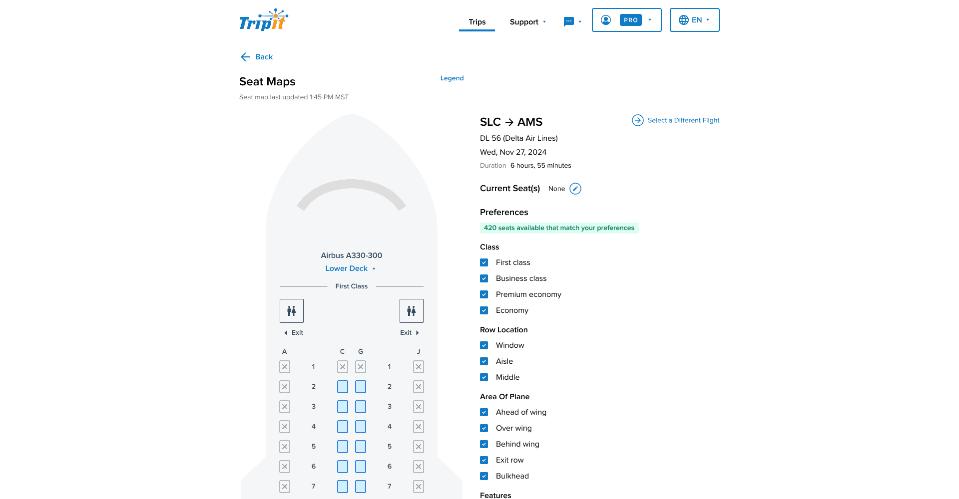
The issue was that travelers needed the data. The answer was to give them the data. Working with engineering, we determined we could pull live, dynamic seat information through a connection to the Sabre reservation system, the same data that had been powering alert checks behind the scenes. The old feature had a static seat map graphic that was purely decorative and showed nothing beyond the seating layout of the aircraft. The new Seat Maps replaced that with a fully interactive schematic showing real-time seat status across the entire cabin: occupied, available, and premium, visible at a glance.
Filtering was where the map became genuinely informative. I designed a filtering system that let travelers instantly scan seats by class, row location, and specific attributes: extra legroom, no recline restriction, proximity to exits. This directly addressed the user need for context: not just “is this seat open” but “is this seat right for this particular flight.”
The trickiest product decision was what to do with Seat Tracker. Sunsetting a paid TripIt Pro feature outright wasn’t an option without eroding the perceived value of the subscription. Instead, we repositioned it as a sub-feature within Seat Maps: if a traveler saw their preferred seat was taken, they could toggle Seat Tracker on directly from the map, using their applied filters as the alert criteria.
On mobile, the core challenge was fitting a dense, variable aircraft schematic onto a small screen without sacrificing usability or accessibility. Rather than forcing travelers to pinch and zoom, I designed a stackable modal sheet architecture: the live aircraft graphic stays anchored on screen at all times, and interaction points trigger bottom-up sheets that layer over it without losing context.
Discoverability had been another consistent weakness in the audience surveys. We kept the existing entry point in the Pro features list but added a new one directly in the flight details section, where seat information was already displayed alongside departure times, gate info, and layover duration. A tappable “View Seat Map” line, placed where travelers were already looking for seat context. No hunting required.
Mobile Prototype
The Outcome
Seat Tracker, TripIt Pro’s lowest-rated feature by every measure we tracked, was replaced with something that actually addressed what travelers needed. The shift from a reactive alert model to a live interactive map wasn’t an incremental improvement; it was a different answer to the same problem. Travelers could now open Seat Maps and see the whole plane and make a seat decision independently, without waiting on a notification that might already be stale.
The feature launched in March 2026. The data hadn’t come in before the layoffs happened. What I can say is that the measurement strategy was in place, the instrumentation was live, and for the first time the feature was set up to answer real questions about user behavior rather than just track whether an alert had been opened.
What This Taught Me
Seat Tracker had accumulated years of incremental thinking around how to make the alerts work better — when the clearer path was to stop and ask whether alerts were the right answer to the user need at all.