
TripIt · Nine-year product overview
What TripIt is
On the surface, TripIt is a travel itinerary app. You book a flight, the confirmation lands in your inbox, and TripIt builds your itinerary for you. Highly rated, fiercely loyal users, the app frequent travelers quietly depend on.
Underneath, it’s three unique problems.
Record management. The canonical itinerary. Trips and plans people create, edit, manage, and share, built from messy data across dozens of sources into a clean, digestible visual representation of your trip.
Real-time monitoring and alerting. Flight alerts that reach you before the airline’s own app does. TripIt turns the volatility of flight statuses into an easily managed set of alerts.
Consumer and enterprise (B2B2C). One product existing alongside SAP Concur’s Travel and Expense app, serving free, pro, and enterprise tiers that each want something different. A conversion problem, a retention problem, and an integration problem at the same time.
Travel is the topic. These are the actual problems.
The whole product
For the first 6 years that I was at TripIt, the design team was 4–5 designers strong. In 2022 that changed rapidly and by the end of that year, I was the solo designer, a position I held through late 2024. From there I led design with one teammate who split her time between TripIt and Concur. Across that stretch I designed nearly every feature in the product while supporting several agile teams at once.
The product ran on one loop: a booking confirmation comes in, gets parsed into a plan, and the plan builds itself into your trip.
How the loop works.
A confirmation reaches TripIt one of two ways: you forward it to plans@tripit.com, or Inbox Sync scans your inbox and finds it for you. From there it’s parsed by DataMapper, TripIt’s internal parser, with an AI fallback for when DataMapper can’t read it. That fallback was TripIt’s first AI feature, which meant designing the flow that explained it, the setting that controlled it, and the way an AI-parsed plan got marked as such. The finished plan drops into an existing trip if the dates fit, or starts a new one. The trip itself is structured for how people actually travel: a scannable trip list, a trip summary built for quick glances on the go, and full plan details underneath for the travelers who want them.
TripIt covered the full travel journey, from planning to post-travel summaries.
The full surface, by phase.
Planning and booking. Neighborhood safety scores (women’s safety, LGBTQ safety, and more) to inform where you stay. Destination guidance like visa and vaccination requirements.
Before the trip. Fare tracker, which flagged when a price drop made you eligible for a refund and regularly put money back in people’s pockets. Seat maps and seat tracker, aimed at getting you out of the middle seat. Check-in reminders that surfaced your confirmation and flight numbers the moment check-in opened.
During the trip. Real-time flight alerts, the highest-value feature in the product. And the itinerary itself, which stayed the single most accurate record of your trip because it built itself from your actual bookings.
Outside of travel. Point tracker, for loyalty balances across programs in one place. Trip cost summaries, pulled from booking data to make post-trip expensing less painful.
Rebuilding the web platform
TripIt’s web platform was rebuilt from the ground up. The job was to take the entire web platform, and piece it back together one surface at a time.
What that took.
The old site had aged into a liability, so the decision was made to replace it entirely rather than keep patching it. That meant redesigning every core flow and every feature for the new web, not porting the old ones over. Mobile stayed largely as it was, picking up only the improvements we decided were worth carrying across, which I was also in charge of designing. Four years is a long time for a rebuild, and a good part of that was the product weathering a long stretch of shifting priorities and team restructures.
Where it was going
By 2025, TripIt’s information architecture still reflected what the app was at the start: a place to view a trip you’d already booked. The product had outgrown that years earlier.
New features for the planning and disruption phases of travel kept getting built, but the structure had nowhere natural to put them, so they landed in places that never quite made sense. A planning tool would end up entry-pointed off a screen that only existed after you’d already planned. And travel had gotten more volatile than the app’s tidy, fixed timeline assumed, which made real disruptions clumsy to handle in a product built around a static trip.
I’d been pushing to rethink the whole structure since 2021. I led the early effort across the design team, brought it back through discovery with customer support, and was driving it again with product when the team was laid off. It’s the work my PM was describing in his testimonial when he wrote that we were just about to hit our stride.
Recognition
4.8 ★
App Store
4.7 ★
Google Play
2023 — People’s Voice Award
2025 — Webby Award + People’s Voice Award
The close-ups
If you want to see how I work a single problem start to finish, these are the deep-dives.

Information Architecture · TripIt
Diagnosing a structural problem that everyone else was solving one symptom at a time
Impact
Earned a director’s sign-off on a restructure that had spent years being dismissed as a design-team concern
Type
Initiative
Platform
Mobile + Web
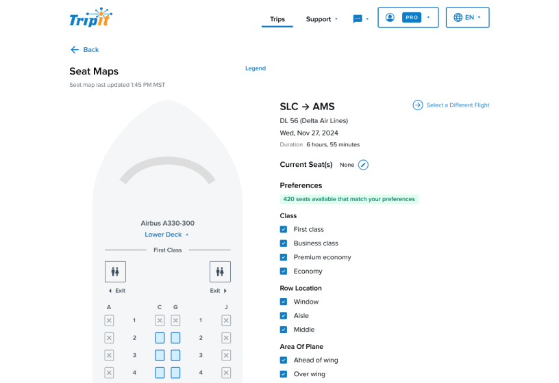
Interactive Seat Map · TripIt
A legacy alert feature that created more frustration than it solved and needed a complete rethink
Impact
Replaced reactive alert fatigue with a live visual tool travelers could act on themselves
Type
Feature overhaul
Platform
Mobile + Web
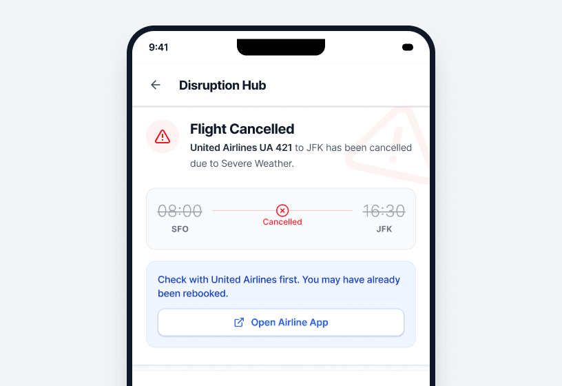
Travel Disruption Response · TripIt
Translating an executive vision into a traveler-facing MVP while navigating real API constraints and competing stakeholder priorities
Impact
A mobile MVP that aimed to give travelers immediate clarity when disruptions hit
Type
Zero to one
Platform
Mobile
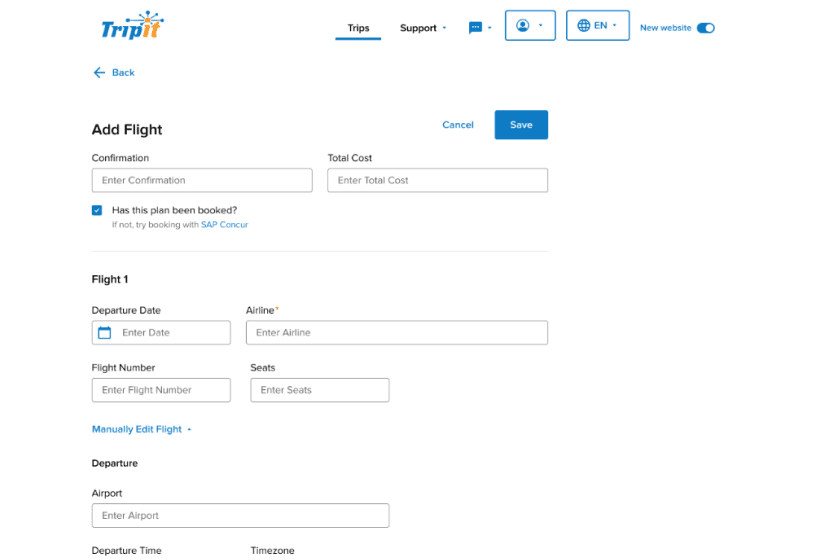
Add/Edit/View Plan · TripIt
Designing one flow that served both casual travelers and power users with deeply specialized needs without making either feel like an afterthought
Impact
One flow that served both mindsets, cutting support tickets and improving server load times
Type
Redesign
Platform
Mobile + Web